Widgets
The widget gallery — every dashboard card, KPI tile, chart widget, list and tracker that ships with Taxi CRM 2026, and how to reuse them.
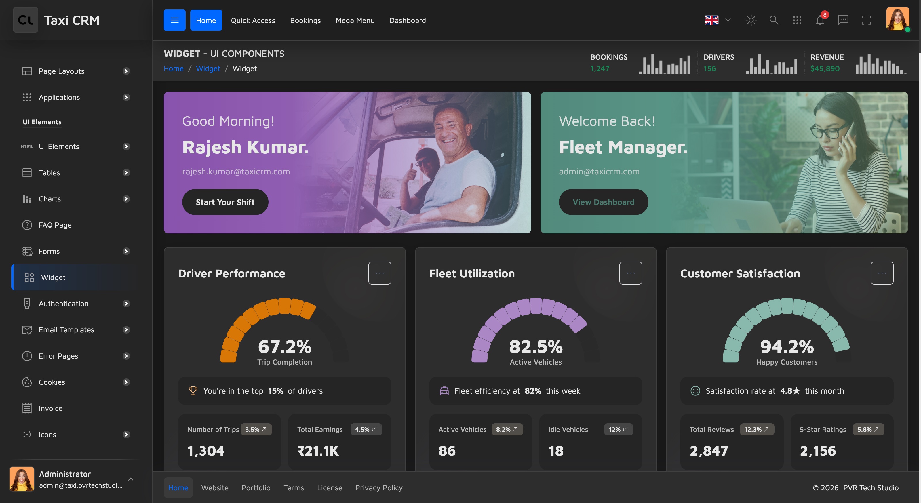
Taxi CRM 2026 ships a large gallery of ready-made widgets — self-contained cards you can
drop into any page. Every widget on this page lives in widgets.html; copy the markup of the
one you want and paste it into your own page. All widgets are plain Bootstrap 5 plus the kit's
classes, already styled by assets/css/style.css, so they work anywhere with no extra setup.
Widget categories
The gallery is grouped so you can find what you need quickly:
| Category | Examples | Typical use |
|---|---|---|
| Welcome / profile cards | Driver profile, Fleet Manager greeting | Top-of-dashboard hero with a call to action |
| Performance cards | Driver Performance, Fleet Utilization, Customer Satisfaction | A single headline % with a circular gauge and sub-metrics |
| KPI stat tiles | Revenue, Active Drivers, Bookings, Avg Wait | Compact metric + trend arrow (north_east / south_west) |
| Breakdown cards | Fare Collection, Fare Breakdown, Trip Analytics, Fleet Status | A total with a stacked progress bar split by category |
| Tracker cards | Income Tracker, Trip Tracker | A sparkline chart with a week-over-week delta |
| Report cards | Trip Report, Statistics | Rich financial/operational tables with a date selector |
| Live trip card | Driver on trip, route stops, fare summary | Real-time pickup → drop tracking with fare math |
| List widgets | Recent Activity, Notifications, Driver Applications, Active Drivers, Recent Customers | Avatar + text + status rows with a View All link |
| Timeline | Today's Timeline | Chronological event feed |
| Calendars | Schedule, Bookings | Month grid with event dots |
| Icon stat tiles | Active Vehicles, GPS Tracking, Airport Trips | Image-icon metric tiles in several visual styles |
Anatomy of a widget
Every widget is a Bootstrap card. A KPI stat tile, for example, is just a .card with an
icon, a value, a label and a trend indicator:
<div class="card widget-stat">
  <div class="card-body">
    <span class="widget-icon"><i class="material-symbols-outlined">payments</i></span>
    <h3 class="widget-value">₹45,280</h3>
    <p class="widget-label">Revenue</p>
    <span class="trend trend-up">+12.5% <i class="material-symbols-outlined">north_east</i></span>
  </div>
</div>Swap the icon, value, label and trend class (trend-up / trend-down) to repurpose it.
Colors
Widget accent colors come only from the kit's pale palette (defined in
01-variable.less) — pale red, orange, soft green, teal, purple, blue and yellow. Stick to
these so widgets stay visually consistent across pages. See
CSS System for the variable list.
Charts inside widgets
The tracker and statistics widgets render real charts (Highcharts in the demo). Each chart
widget has a container element plus a small init script under
assets/js/pages/charts/. See Charts for how chart widgets are wired
and how to swap in your own data.
Reusing a widget
- Open
widgets.htmlin the browser and find the card you want. - Copy that card's markup from the source.
- Paste it into your page inside a row/column (see Layout).
- Replace the demo values, icon and labels with your own — or wire it to live data.
Widgets that show charts or live data also need their page script included. Copy the matching
<script>include from the bottom ofwidgets.htmlalong with the markup.
Was this page helpful?