Drivers & Attendance
The driver registry, add/edit form, attendance and break logs, attendance report and driver-application inbox in Taxi CRM 2026.
The Drivers & Attendance area covers everything about the people behind the wheel: the
driver registry (driver.html), the add/edit driver form (addDriver.html), the daily
attendance and break log (attendanceBreak.html), the shift-based attendance report
(attendanceReport.html) and the driver-application inbox (contactApplication.html).
All five pages are built from the same shared layout — the same header, sidebar, page header
and card panels — so they inherit the kit's layout, sticky header and
i18n wiring. The list pages are standard DataTables; only contactApplication.html uses a
custom two-pane master/detail layout. See Layout for the page
scaffold, Tables for DataTables, and Forms
for form controls.
Driver Registry (driver.html)
Purpose. The master list of all registered drivers. Users: fleet managers and dispatch admins who maintain driver records.
The page is a single card panel ("Driver Registration") wrapping a DataTable
(#initDataTable). A hidden filter panel (#show_multiple_filter_div) provides the
multi-criteria "Driver Search" form, populated into #append_col. Data is loaded by
assets/js/pages/masters/driver.js.
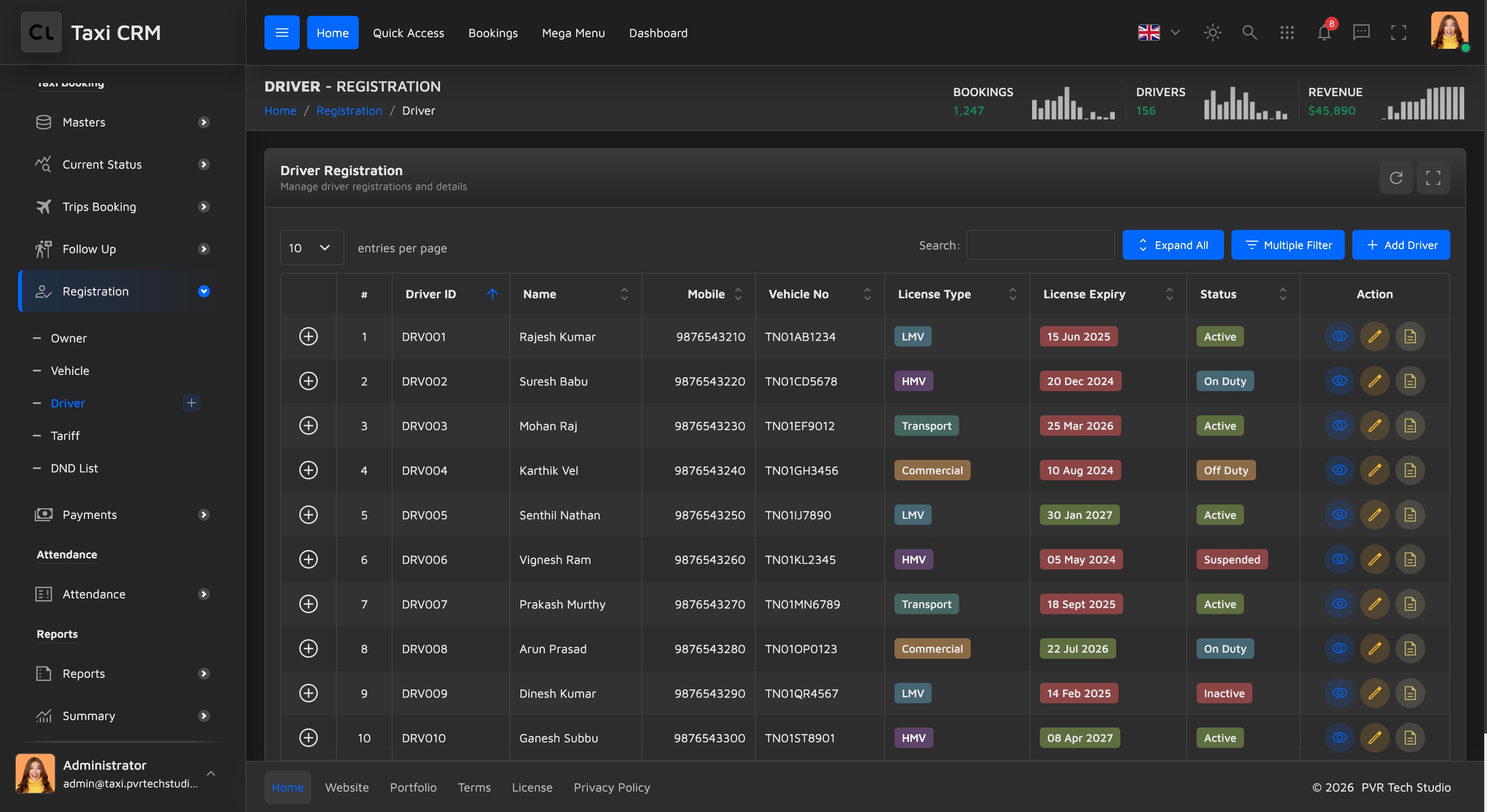
Table columns:
| Column | Notes |
|---|---|
| (control) | DataTables child-row / responsive toggle |
| # | Row index |
| Driver ID | apply_search column |
| Name | apply_search |
| Mobile | apply_search |
| Vehicle No | apply_search |
| License Type | apply_select (dropdown filter) |
| License Expiry | apply_search, left-aligned |
| Status | apply_select (dropdown filter) |
| Action | Row action buttons (edit / view / delete) |
The apply_search class marks a column for text filtering; apply_select renders a
dropdown filter — both are wired by the shared table init. See
Tables.
Customize. Add or remove a th in the thead and mirror it in the row template inside
driver.js. Keep the leading empty th (responsive control column). To change which columns
are filterable, swap the apply_search / apply_select classes.
Add / Edit Driver (addDriver.html)
Purpose. Register a new driver or edit an existing one. Users: the same fleet/dispatch admins; reached from the registry's Add button and row Edit action.
A single card panel ("Add New Driver") holds form#addDriverForm, organised into labelled
sections with h6.text-muted headers. All inputs use Bootstrap floating labels
(.form-floating); dropdowns use .select2. Scripts:
assets/js/pages/shared/data.js and assets/js/pages/masters/addDriver.js.
Form sections and fields:
| Section | Fields |
|---|---|
| Personal Information | Driver Name, Mobile Number, Email Address, Date of Birth, Blood Group (select2), Emergency Contact |
| Address Information | Address (textarea), City |
| License Information | License Number, License Type (select2: LMV / HMV / Transport / Commercial), License Expiry |
| Identity Documents | Aadhar Number, Assign Vehicle (select2, populated at runtime), Joining Date |
| Work Information | Experience, Status (select2: Active / Inactive / On Duty / Off Duty / Suspended), Remarks (textarea) |
The footer has a red Cancel link back to driver.html and a green Submit button. The
Blood Group, License Type, Vehicle and Status select elements are Select2 controls — see
Forms.
Customize. Add a field by copying a .col-lg-4 > .form-floating block (input + matching
label[for]); keep name and id in sync. The "Assign Vehicle" select ships empty and is
filled at runtime, so wire its options in addDriver.js. Field labels carry
data-i18n="addDriver.*" keys — see Internationalization.
Attendance & Break (attendanceBreak.html)
Purpose. The daily log of driver login/logout, work hours and break time. Users: operations staff monitoring who is on duty and on break.
The page opens with a widget-stats-card-3 dashboard panel split into two halves: a left side
with a "Daily Attendance Progress" Highcharts area (#attendanceChart) plus a top-drivers
member list (#topDriversList), and a right side with a "Weekly Breakdown" polar radial chart
(#radialProgressChart) and a colour-dotted summary — Logged In (purple), On Break
(blue) and Absent (green), bound to #summaryLoggedIn, #summaryOnBreak, #summaryAbsent.
Below it sits the hidden "Attendance Search" filter panel and the main
"Attendance & Break Records" DataTable. Script:
assets/js/pages/bookings/attendanceBreak.js.
Table columns:
| Column | Notes |
|---|---|
| (control) | Responsive toggle |
| # | Row index |
| Driver Name | apply_search |
| Driver ID | apply_search |
| Vehicle No | apply_search |
| Login Time | apply_search |
| Logout Time | apply_search |
| Work Hours | apply_search |
| Break Time | apply_search |
| Status | apply_select |
| Action | Row actions |
Customize. The two charts are Highcharts instances initialised in attendanceBreak.js;
swap the series data there. The summary dot modifiers (--purple, --blue, --green) come
from the widget's stylesheet — see Widgets for the
widget-stats-card-3 anatomy and Charts for chart wiring.
Attendance Report (attendanceReport.html)
Purpose. A shift-oriented report of driver attendance with trip count and fare collection per shift. Users: managers reviewing per-shift performance and payroll inputs.
A lean card panel ("Attendance Report") wrapping a DataTable, preceded by the hidden
"Attendance Search" filter panel (filter by date range). Script:
assets/js/pages/reports/attendanceReport.js.
Table columns:
| Column | Notes |
|---|---|
| (control) | Responsive toggle |
| # | Row index |
| VID | Vehicle ID, apply_search |
| Driver | apply_search |
| Schedule | apply_select (shift dropdown) |
| Start Time | Plain column |
| Trips | Right-aligned (text-end) |
| Collection | Right-aligned fare total |
| Status | apply_select |
Customize. This is a report variant of the same DataTable pattern, with no Action column —
add one only if rows need drill-down. The numeric Trips and Collection columns use
text-end; keep that alignment for any added numeric columns. See
Tables.
Driver Applications (contactApplication.html)
Purpose. A master/detail inbox for incoming driver applications — review, document verification, interview scheduling and approve/reject. Users: the hiring/onboarding team.
Unlike the other pages this is not a DataTable. It uses a custom
.contact-application-container two-pane layout (left list, right detail) styled by its own
CSS and driven by assets/js/pages/ui/contactApplication.js. The main element carries
data-page="contactApplication".
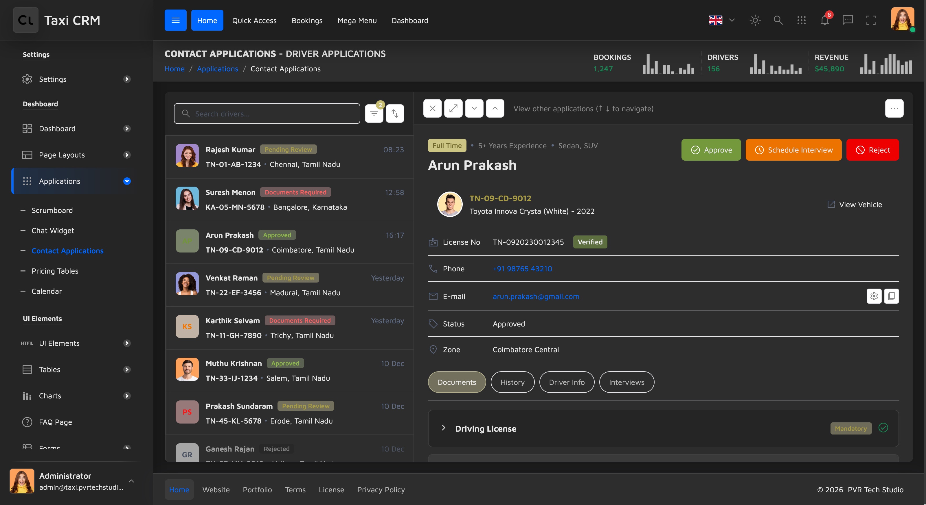
Left panel — application list. A search box (.search-input), a filter dropdown with
status options (Pending Review, Documents Required, Approved, Rejected) and a filter-count
badge, a sort button, then a scrolling list of .contact-list-item rows. Each row has a
coloured avatar (or initials), the driver name, a status badge (badge-yellow-light,
badge-red-light, badge-green-light, badge-gray-light), a time, and the license/vehicle
ref plus city. Per-row data lives in data- attributes (data-contact-id, data-license,
data-phone, data-email, data-zone).
Right panel — application detail. Sections:
| Section | Contents |
|---|---|
| Header bar | Close, expand and up/down navigation buttons; a more_horiz actions dropdown (Edit / Share / Print / Delete) |
| Driver header | Tag row (Full Time, experience, vehicle types), name, and quick-action buttons — green Approve, orange Schedule Interview, red Reject |
| Vehicle card | .detail-property-card with vehicle ref, model and a View Vehicle link |
| Info list | License No (with Verified badge), Phone, E-mail (with copy button), Status, Zone |
| Tabs | Documents, History, Driver Info, Interviews |
The Documents tab is a Bootstrap accordion (#dossierAccordion) with one item per
document type (Driving License, Aadhar Card, Vehicle RC, Insurance, Police Verification),
each carrying a Mandatory/Optional badge, a verification status icon, and download/delete
actions or an empty-state uploader. History is a vertical timeline, Driver Info is a
question/answer list, and Interviews lists appointment cards with an Schedule Interview
button. A .mobile-back-btn (d-lg-none) returns to the list on small screens.
Customize. Add an application by cloning a .contact-list-item and setting its data-
attributes; the detail pane is populated from those by contactApplication.js. Add a document
row by cloning an .accordion-item. Status badges follow the kit's badge palette — see
CSS System (do not use badge-disabled). Labels use
data-i18n="contactApplication.*" — see Internationalization.
Was this page helpful?