Page Layouts
Ready-made shell variants — fixed/unfixed nav, header and footer plus sidebar styles — that you copy as a starting skeleton for your own pages.
Taxi CRM 2026 ships a set of page-layout demos — bare pages whose only purpose is to show the different shell arrangements you can build with the kit. Each one is a thin skeleton (header, sidebar, page header, footer, a few placeholder panels) that toggles a single layout option, so you can see what changes and copy the variant that fits your page.
They all share the same shell documented in
Layout — the header navbar, the aside.app-sidebar rail, the
main content area with its page-header bar, and the footer. This page does not re-explain
that markup; it only documents which class each demo flips so you can reproduce the same shell
in the compiled HTML you receive. For the full grid system, panels and the page scaffold, read the
Layout doc first.
How the shell is controlled
In the delivered HTML, every variant is the same skeleton with one or two CSS classes added or removed. There is no build step or template option to set — you simply add or drop the class on the element shown below.
| Toggle | Where it lives | Effect |
|---|---|---|
minSidebar class on <body> | the <body> tag | Renders the sidebar in its collapsed (icon-only) state on load. |
#primaryNav block | inside the top <nav> | When present, the horizontal quick-access menu (Home / Quick Access / Bookings / Mega Menu / Dashboard) shows; when removed, the top bar carries only the right-side actions. |
fixed-top on the top navbar | nav.navbar.navbar-expand-md | Keeps the top bar pinned while you scroll; drop it and the bar scrolls away. |
page-header-fixed on the page header | div.page-header | Makes the title/breadcrumb bar sticky; drop it and the bar scrolls with the content. |
has-sticky-header on main | <main> | Reserves space for the pinned navbar above. Present whenever the top bar (or page header) is sticky. |
has-fixed-footer on main | <main> | Pads the content clear of a footer that is pinned to the bottom. |
fixed-bottom on the footer navbar | footer nav.navbar.navbar-expand-lg | Pins the footer to the bottom of the viewport; drop it and the footer scrolls with content. |
The summary below maps each demo page to the class change that produces it. Every page keeps the
left sidebar (aside.app-sidebar); the differences are only the classes named above.
| Layout page | What it demonstrates | The class change that produces it |
|---|---|---|
sidebarLayout | Sidebar shell with the top quick-access menu hidden | No #primaryNav block in the navbar |
minifiedSidebar | Same shell but the sidebar starts collapsed | minSidebar class on <body> |
topNavFixed | Sidebar plus a sticky horizontal top nav | Navbar has fixed-top, page header has page-header-fixed |
unfixedTopNav | Top nav that scrolls away | Navbar without fixed-top, page header without page-header-fixed, main without has-sticky-header |
fixedNavUnfixedHeader | Sticky top nav, but the page header scrolls | Navbar fixed-top, page header without page-header-fixed |
unfixedNavFixedHeader | Top nav scrolls, page header stays stuck | Navbar without fixed-top, page header page-header-fixed, main without has-sticky-header |
fixedFooter | Footer pinned to the bottom of the viewport | main gets has-fixed-footer; footer keeps fixed-bottom |
unfixedFooter | Footer that scrolls with the content | Footer navbar without fixed-bottom |
bothMenubar | Top nav and sidebar visible together | #primaryNav present alongside the sidebar |
sidebarLayout
The baseline shell: a left sidebar for navigation and a main content column, with the horizontal
top menu switched off. In the HTML this is the standard shell with the #primaryNav block
simply removed from the navbar, so the top bar carries only the right-side actions (search, theme,
notifications, profile). The navbar still uses fixed-top and the page header is sticky, so main
keeps has-sticky-header:
<nav class="navbar navbar-expand-md fixed-top"><!-- no #primaryNav inside --></nav>
<main class="d-flex flex-column has-sticky-header">
  <div class="page-header page-header-default page-header-fixed"> … </div>
</main>Use this when the app is navigation-heavy and you want all menu items in a persistent left rail without a competing top bar.
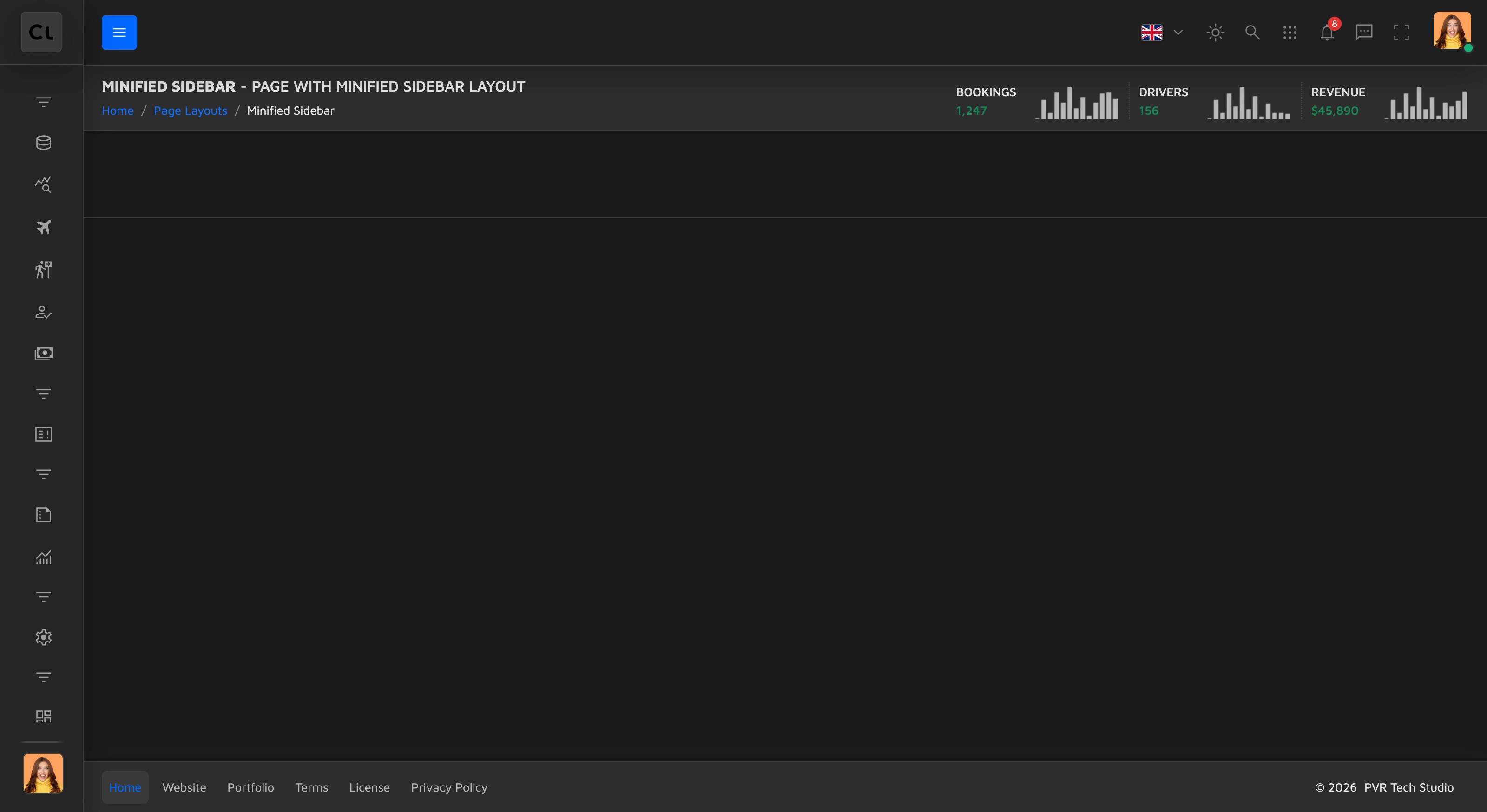
minifiedSidebar
Identical to sidebarLayout in structure, but the page loads with the sidebar collapsed to its
icon-only state. The only difference is the minSidebar class on the <body> tag:
<body class="minSidebar">Use this when you want to maximise content width by default while keeping the sidebar one click (hover/toggle) away.
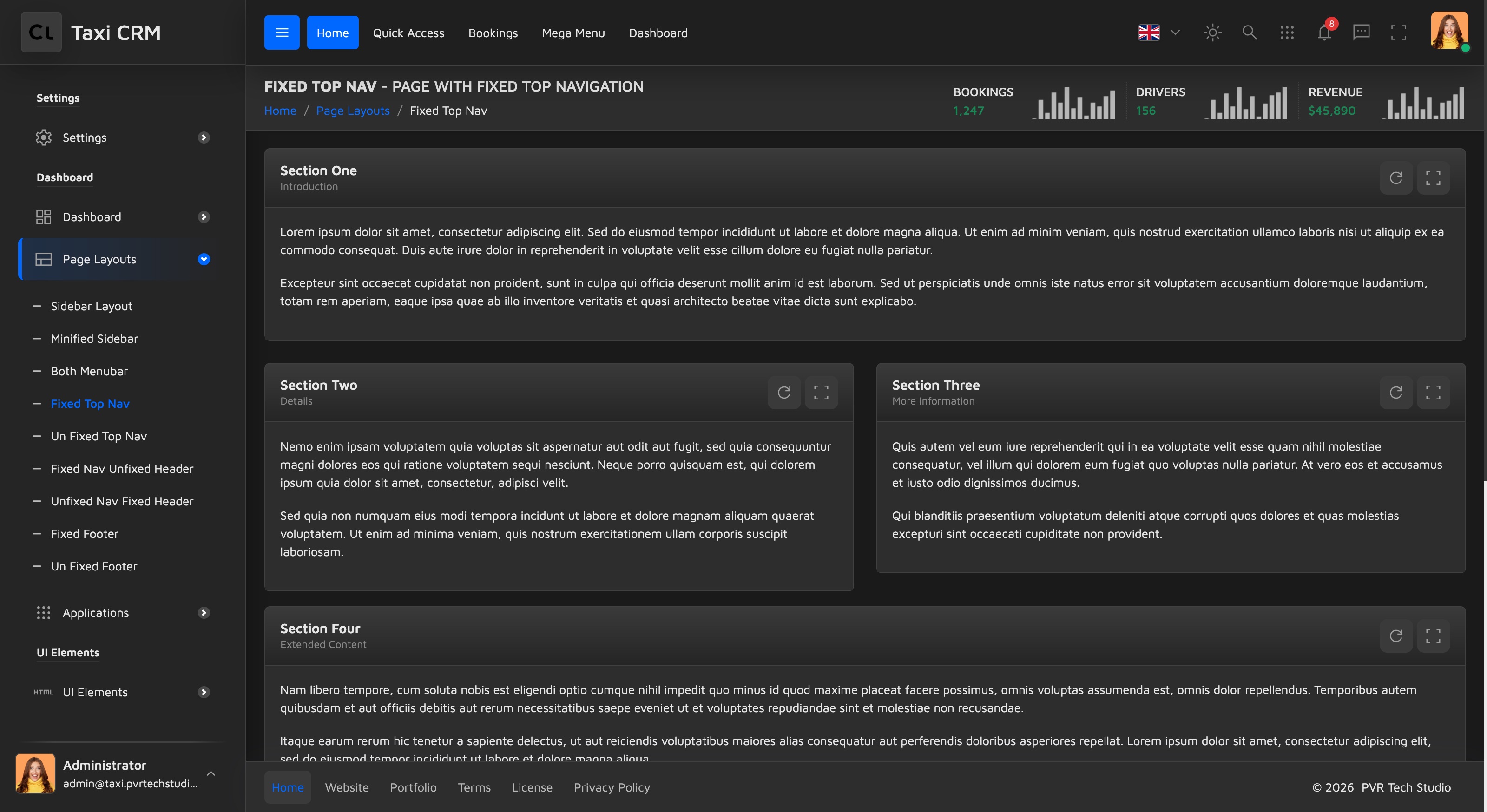
topNavFixed
Adds the horizontal top navigation and keeps it pinned to the top while you scroll. The
#primaryNav block is present, the navbar carries fixed-top, and the page header carries
page-header-fixed so it sticks too — which is why main keeps has-sticky-header:
<nav class="navbar navbar-expand-md fixed-top">
  <div class="collapse navbar-collapse" id="primaryNav"> … </div>
</nav>
<main class="d-flex flex-column has-sticky-header">
  <div class="page-header page-header-default page-header-fixed"> … </div>
</main>Use this when you want primary navigation always reachable at the top regardless of scroll position.
unfixedTopNav
The opposite of the fixed shell: the top nav scrolls away with the page, and the page header is not
sticky either. The navbar drops fixed-top, the page header drops page-header-fixed, and because
nothing is pinned main also drops has-sticky-header:
<nav class="navbar navbar-expand-md"><!-- no fixed-top --></nav>
<main class="d-flex flex-column"><!-- no has-sticky-header -->
  <div class="page-header page-header-default"><!-- no page-header-fixed --> … </div>
</main>Use this when you prefer a document-style page that reclaims all vertical space as the user scrolls.
fixedNavUnfixedHeader
A mix: the top nav stays pinned but the page header scrolls away. The navbar keeps
fixed-top and main still keeps has-sticky-header (to reserve space under the pinned bar), but
the page header drops page-header-fixed:
<nav class="navbar navbar-expand-md fixed-top"> … </nav>
<main class="d-flex flex-column has-sticky-header">
  <div class="page-header page-header-default"><!-- no page-header-fixed --> … </div>
</main>Use this when the global nav must always be visible but the per-page title/breadcrumb bar can yield space once the user starts reading.
unfixedNavFixedHeader
The inverse of the page above: the top nav scrolls away while the page header stays stuck.
The navbar drops fixed-top, so main also drops has-sticky-header, but the page header keeps
page-header-fixed:
<nav class="navbar navbar-expand-md"><!-- no fixed-top --></nav>
<main class="d-flex flex-column"><!-- no has-sticky-header -->
  <div class="page-header page-header-default page-header-fixed"> … </div>
</main>Use this when the page-level toolbar (title, breadcrumbs, quick stats) is what users interact with most, and the global nav can be scrolled out of the way.
fixedFooter
Pins the footer to the bottom of the viewport. The footer navbar keeps its default fixed-bottom
class, and the main wrapper adds has-fixed-footer so content is padded clear of the pinned bar:
<main class="d-flex flex-column has-sticky-header has-fixed-footer"> … </main>
<footer class="app-footer">
  <nav class="navbar navbar-expand-lg fixed-bottom"> … </nav>
</footer>Use this when you want footer links/legal/actions permanently visible — common on form or wizard-style pages.
unfixedFooter
The footer scrolls with the content instead of sticking. This is the only page whose footer navbar
drops fixed-bottom; main stays a normal has-sticky-header shell (no has-fixed-footer):
<main class="d-flex flex-column has-sticky-header"> … </main>
<footer class="app-footer">
  <nav class="navbar navbar-expand-lg"><!-- no fixed-bottom --></nav>
</footer>Use this when the footer is informational and shouldn't take up viewport space on long pages.
bothMenubar
Shows the horizontal top nav and the left sidebar at the same time — the fullest navigation
shell. The #primaryNav block is present inside the fixed-top navbar, the aside.app-sidebar
rail is present, and the page header is sticky:
<nav class="navbar navbar-expand-md fixed-top">
  <div class="collapse navbar-collapse" id="primaryNav"> … </div>
</nav>
<aside class="app-sidebar flex-column drawer drawer-start"> … </aside>
<main class="d-flex flex-column has-sticky-header">
  <div class="page-header page-header-default page-header-fixed"> … </div>
</main>Use this when you have both broad top-level sections (top nav) and deep per-section navigation (sidebar) to expose at once.
All nine pages share the exact same body content scaffold (placeholder panels in a
.row). When you adopt a variant, copy its<body>class, the navbar/page-header/footer classes and themainclasses shown above, then drop your real content into the.pageWrapperrow — see Layout.
Was this page helpful?